Minerals
Build a design system
Turning a UI kit every designer used differently into a shared, documented system that more than 20 products built on.

- 20+ products
- built on one shared system
- 1,576,576
- users impacted
My role
UX product designer. I set the strategic context, found the opportunities, defined the structure, and created and refined the components for versions 2.0 and 3.0.
The problem
A UI kit that every designer used in their own way, and teams that started from scratch on every project.
The result
Live on 8 products in the first three months. Later, more than 20 products and over 1.5 million users.
A UI kit that everyone used differently
Minerals was the first UI library at Credijusto, and it had a problem. Each designer used it in their own way, so the same button or card came out with a different size, spacing or color from one product to the next. Teams were also working in silos. They often started from scratch on every project instead of building on each other's work.
What we set out to do
The goal was a design system with a clear vision, principles, processes, and a tone and voice. A system like that could speed up the work and improve the quality of the experiences. We started with four objectives: assess our legacy library, standardize our components, develop new ones, and implement them in our products.
Finding out where we really were
I started with workshops with the team to find the differences between our experiences. The audit showed that products used different atoms, component sizes and layouts, and that there was no typography hierarchy at all.
The harder problems were about people. Designers weren't talking to each other across projects, and few of them used the UI kit.
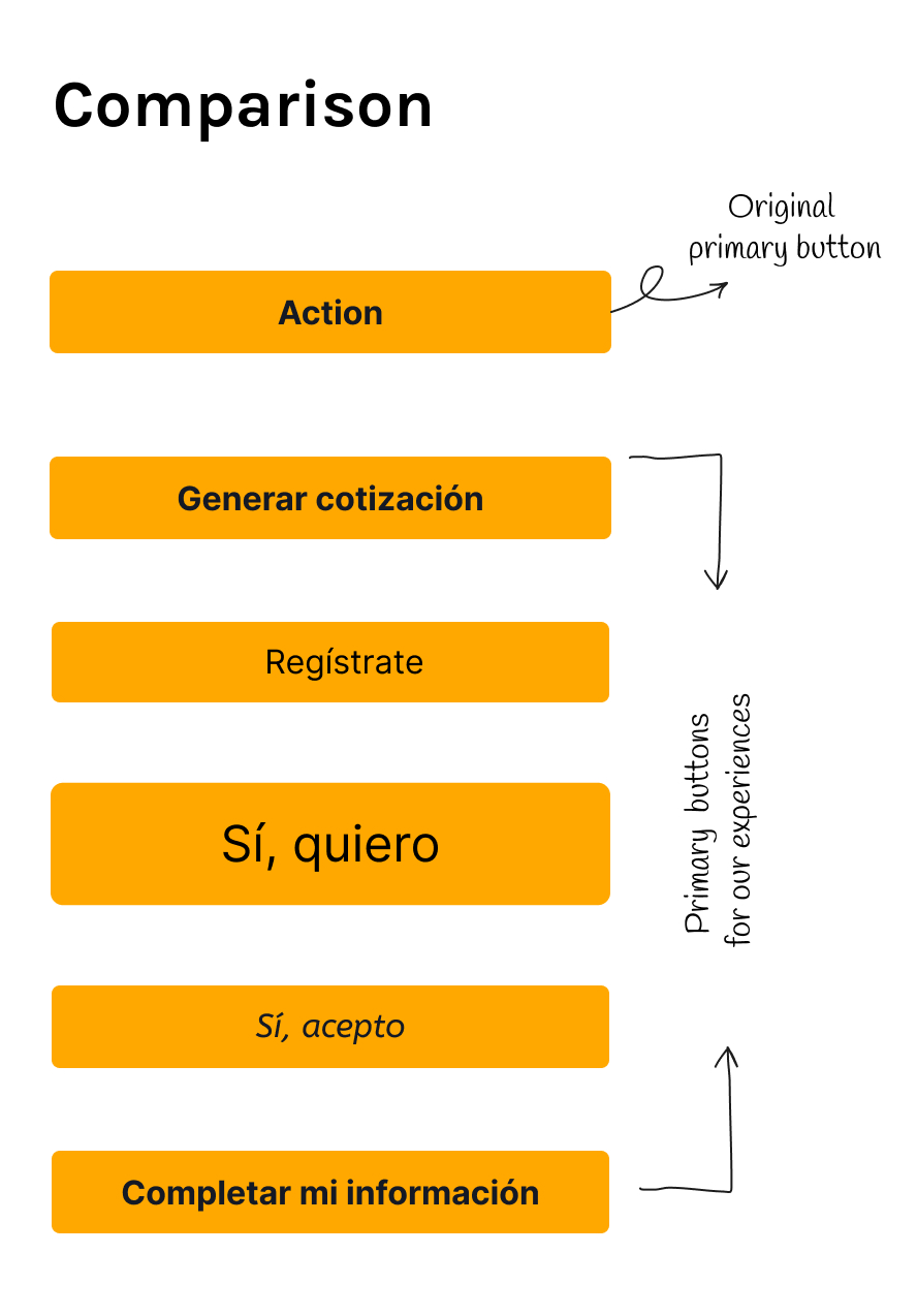 Comparison of primary buttons. The original primary button, labeled Action, is orange with bold dark text. Below it are five primary buttons used across the company's experiences. All are orange, but they differ in text, weight, size and corner: Generar cotización, Regístrate, Sí quiero (larger and lighter), Sí acepto (italic) and Completar mi información. Hand-drawn arrows label the first as the original primary button and the rest as primary buttons for our experiences.
The primary buttons used across our experiences.
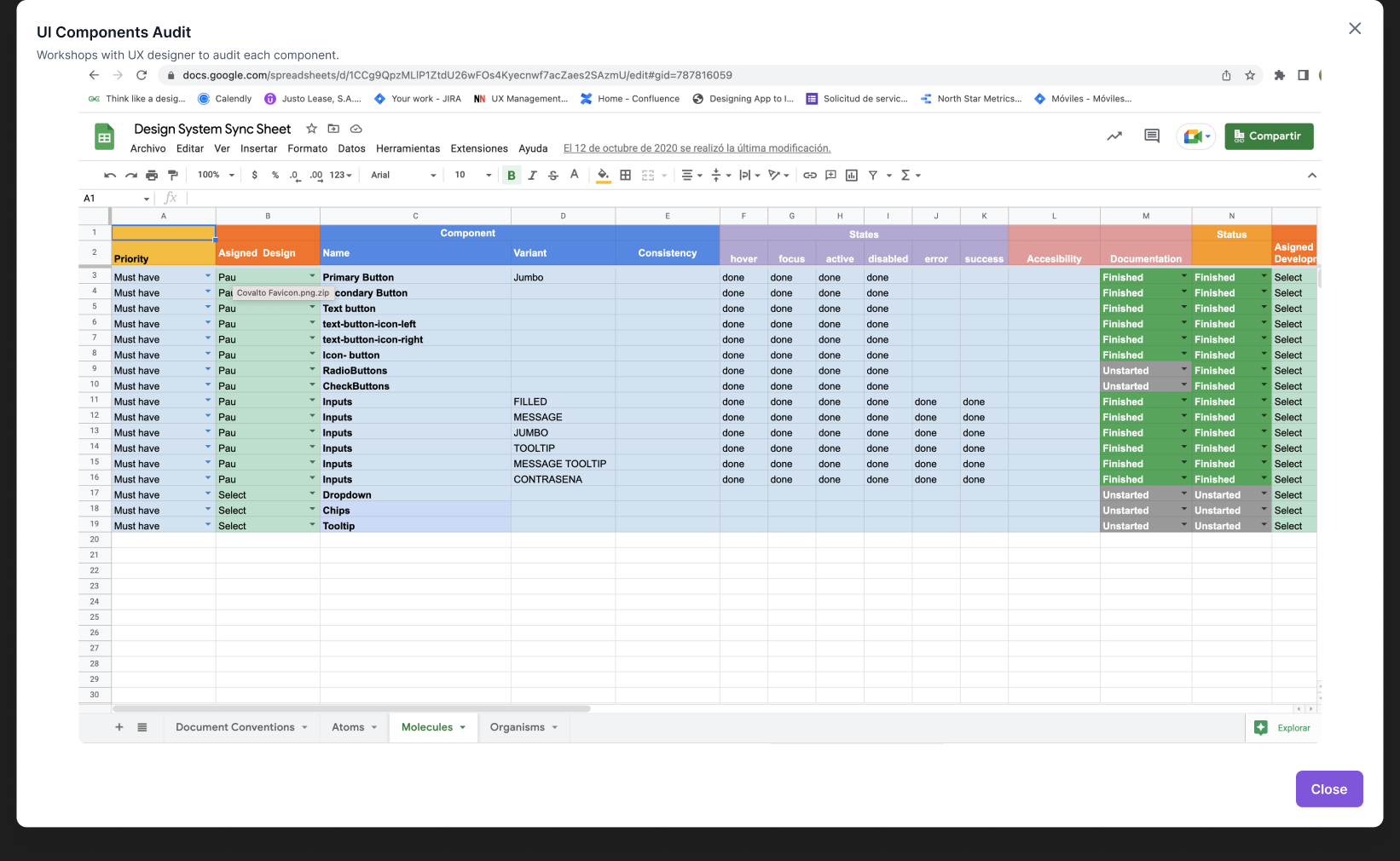 Screenshot of a Google Sheet called Design System Sync Sheet, shown under the heading UI Components Audit: workshops with UX designer to audit each component. Each row is a component. Columns cover priority (all Must have), assigned designer, component name and variant, consistency, states (hover, focus, active, disabled, error, success), accessibility, documentation status and development status. Rows include primary button, secondary button, text button, text buttons with icon left and right, icon button, radio buttons, check buttons, input variants (filled, message, jumbo, tooltip, message tooltip, password), dropdown, chips and tooltip. Most are marked done and Finished. Radio buttons, check buttons, dropdown, chips and tooltip are still Unstarted for documentation. Tabs along the bottom: Document Conventions, Atoms, Molecules, Organisms.
The synchronization sheet.
Next I built a design system synchronization sheet, so everyone could see the status of every component. Developers started using it too.
It showed us that no component had all of its states documented. Engineering kept writing a fresh version of the same component for nearly every project, even with a library in place. And the design system had no way of working yet. Because I knew the status of every component, I could plan the order of the work and the vision of the product.
Fixing the visual inconsistencies alone would have given us a better-looking version of the same problem a year later. The work had to include communication too.
A process that kept moving
We ran Minerals as four repeating phases: research, audit, create and maintain. Each one had its own steps for understanding, agreeing, defining, validating and supporting. We kept them moving with biweekly workshops across designers instead of a one-time handoff. Because time and resources were limited, we started with the components that face the client and moved on to the internal tools after that.
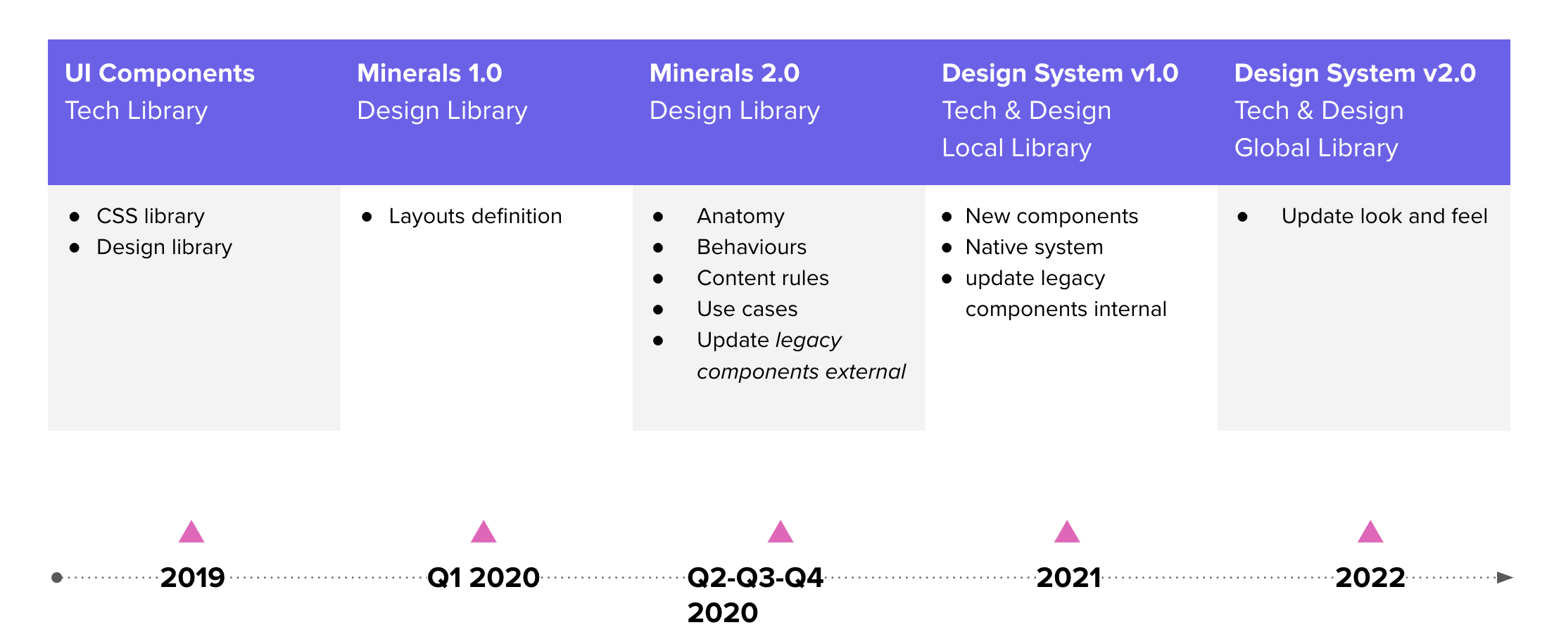 Timeline of how the library grew from 2019 to 2022, in five stages. 2019, UI Components, a tech library: a CSS library and a design library. Q1 2020, Minerals 1.0, a design library: layouts definition. Q2 to Q4 2020, Minerals 2.0, a design library: anatomy, behaviours, content rules, use cases, and updating legacy components externally. 2021, Design System v1.0, a tech and design local library: new components, native system, and updating legacy components internally. 2022, Design System v2.0, a tech and design global library: update look and feel.
We prioritized with the MoSCoW method and structured the system with Atomic Design, so design and engineering could talk about the same piece of UI at any level. Every component got a name built from the same parts: type, hierarchy, size, color mode, state and icons.
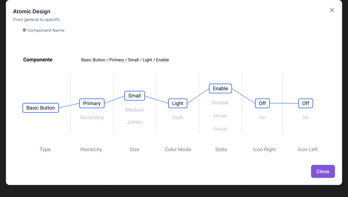 Diagram titled Atomic Design, from general to specific, for the component name Basic Button / Primary / Small / Light / Enable. A line connects one choice in each of seven columns. Type: Basic Button. Hierarchy: Primary, with Secondary as the other option. Size: Small, with Medium and Jumbo as the others. Color Mode: Light, with Dark as the other. State: Enable, with Disable, Hover and Focus as the others. Icon Right: Off, with On as the other. Icon Left: Off, with On as the other.
How every component is named.
What every component went through
Anatomy and behavior
Starting from the inventory, we wrote the rules, limits and principles for each component. We also reviewed each one side by side with what actually shipped, so design and code stopped drifting apart.
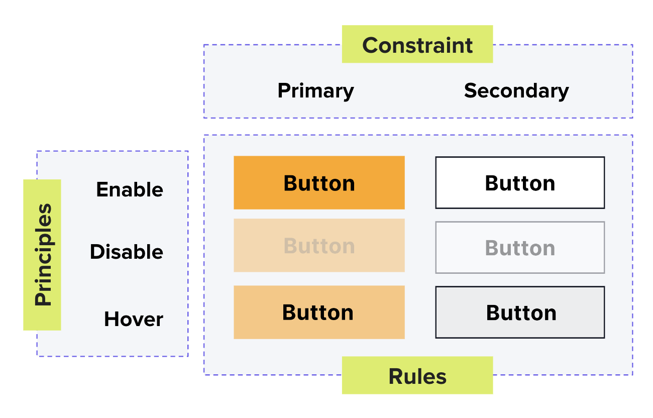 Diagram of the rules and states of a button. A Constraint box lists two button types: Primary, which is orange, and Secondary, which is white with a dark outline. A Principles box lists three states: Enable, Disable and Hover. A Rules grid shows each type in each state. The enabled button is full color, the disabled button is faded with gray text, and the hover button is a slightly different shade.
Rules and states of a button.
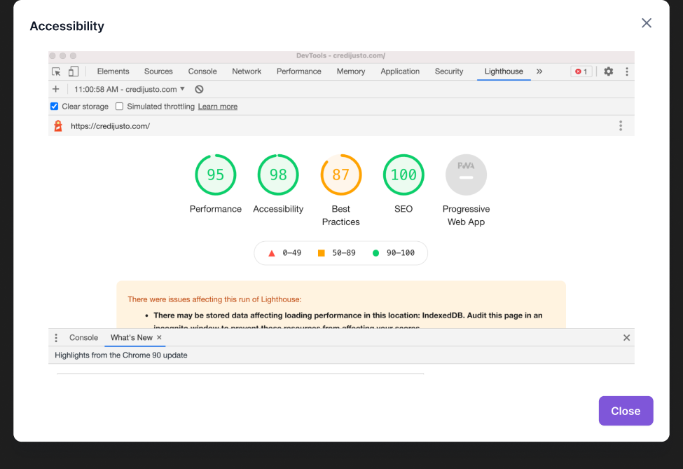 Screenshot of a Lighthouse audit of credijusto.com in Chrome DevTools, under the heading Accessibility. Scores: Performance 95, Accessibility 98, Best Practices 87, SEO 100. Progressive Web App is not scored. A notice says there were issues affecting this run, including stored data (IndexedDB) that may affect loading performance.
Lighthouse audit of credijusto.com.
Accessibility
I set accessibility standards at the AA and AAA levels and used a contrast checker to validate every color pairing. Credijusto's site later scored 98 for accessibility and 95 for performance in Lighthouse, on the same site that used to load in over 8 seconds.
Content rules and documentation
There were many forms across our tools, so I built a content matrix to standardize how we collect data. Every component also got documentation and a quality control checklist.
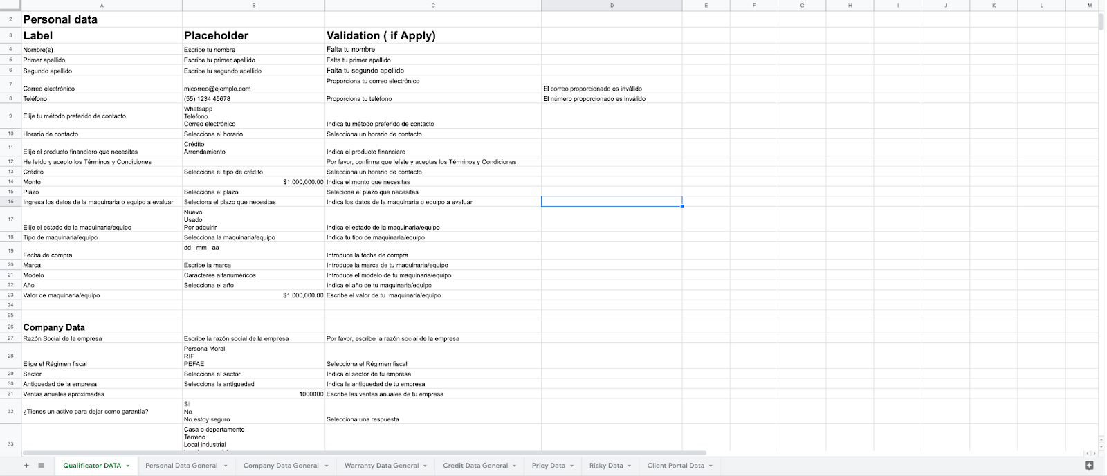 Screenshot of a spreadsheet, the content matrix for forms, with three columns: Label, Placeholder and Validation. The sections are Personal data (names, email, phone, preferred contact method, contact time, financial product, credit type, amount, term and machinery or equipment details) and Company data (company name, tax regime, sector, company age, annual sales and collateral). Each row gives the Spanish label, the placeholder text and the validation message, for example Falta tu nombre. Tabs at the bottom: Qualificator DATA, Personal Data General, Company Data General, Warranty Data General, Credit Data General, Pricy Data, Risky Data and Client Portal Data.
The content matrix for forms.
The first color palette was hard for both designers and developers to work with. We cut it down to a smaller, simpler one before the system went wide.
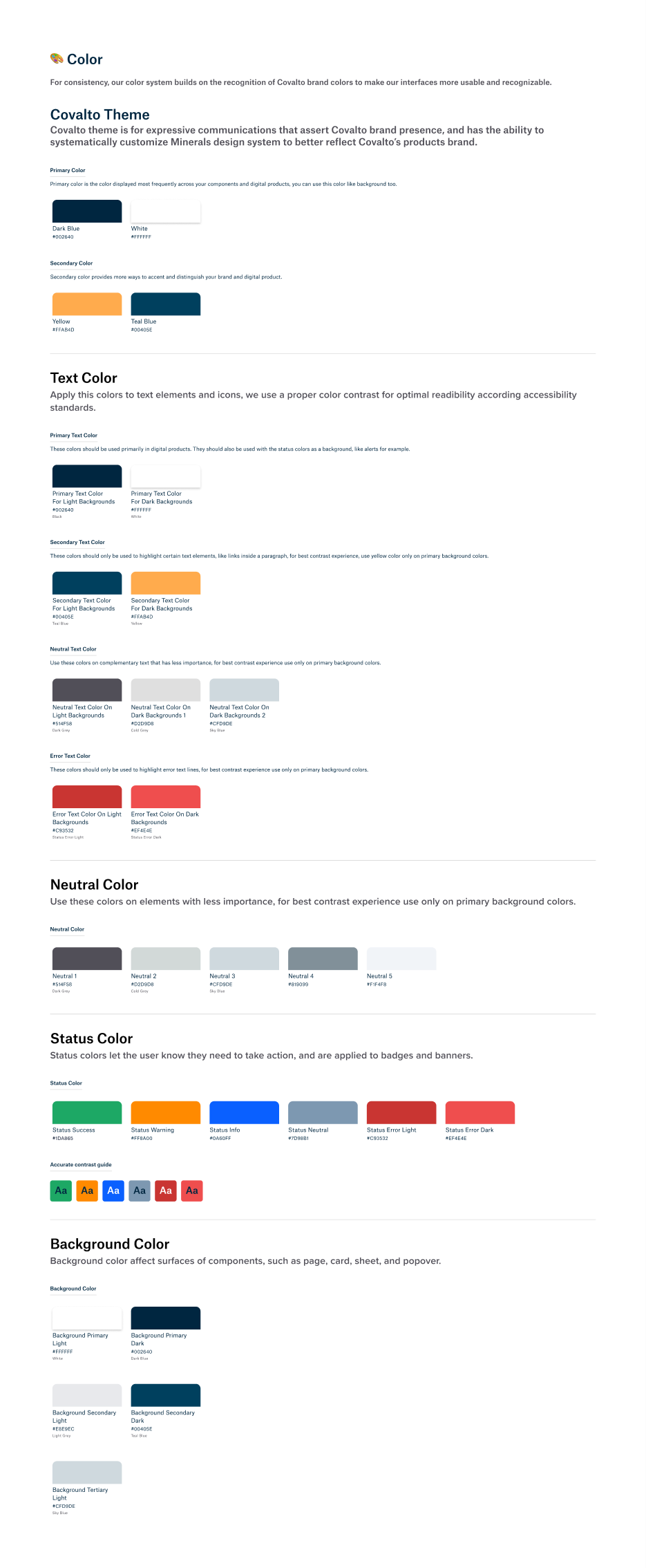 Long color documentation page for the Minerals design system, Covalto theme. Covalto Theme: primary colors Dark Blue #002640 and White #FFFFFF, secondary colors Yellow #FFAB4D and Teal Blue #00405E. Text Color: primary text is dark blue on light backgrounds and white on dark backgrounds; secondary text is teal blue on light backgrounds and yellow on dark backgrounds; neutral text and error text each have a light-background and a dark-background version. Neutral Color: five greys from dark gray to near white. Status Color: success green, warning orange, info blue, neutral gray-blue, and two error reds, with a contrast guide showing Aa on each. Background Color: primary light white, primary dark dark blue, secondary light light gray, secondary dark teal blue, and tertiary light sky blue.
Where Minerals ended up
Within the first three months of rollout, Minerals was live on 8 products, and 19,804 users were touching it directly. It kept growing. By full maturity it backed more than 20 products across the growth site, the internal tools and the digital banking apps, with 1,576,576 users in total. A documented, versioned system had replaced the original single UI kit.
The internal tools were never an afterthought. Risky (risk analysis) and Pricy (vendor management) ran on the same components as the customer-facing app, so a chart or a data table looked and behaved the same everywhere. By the time Minerals 4.0 shipped in March 2022, it had a new font (Atlas Grotesk), a simplified secondary color palette and components for the Covalto app itself. That showed the system could take on new surfaces without being rebuilt for each one.
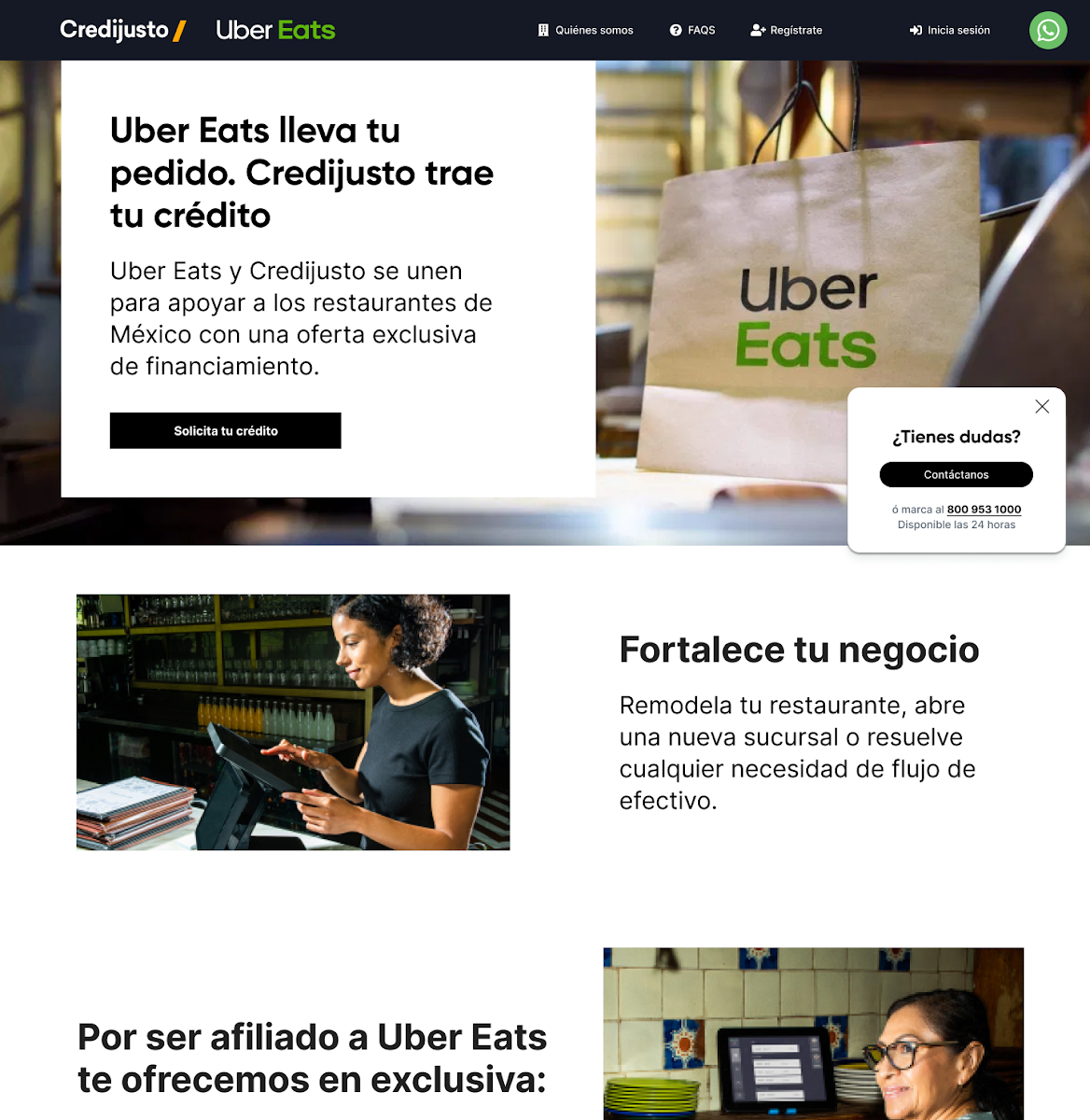
Credijusto x Uber Eats
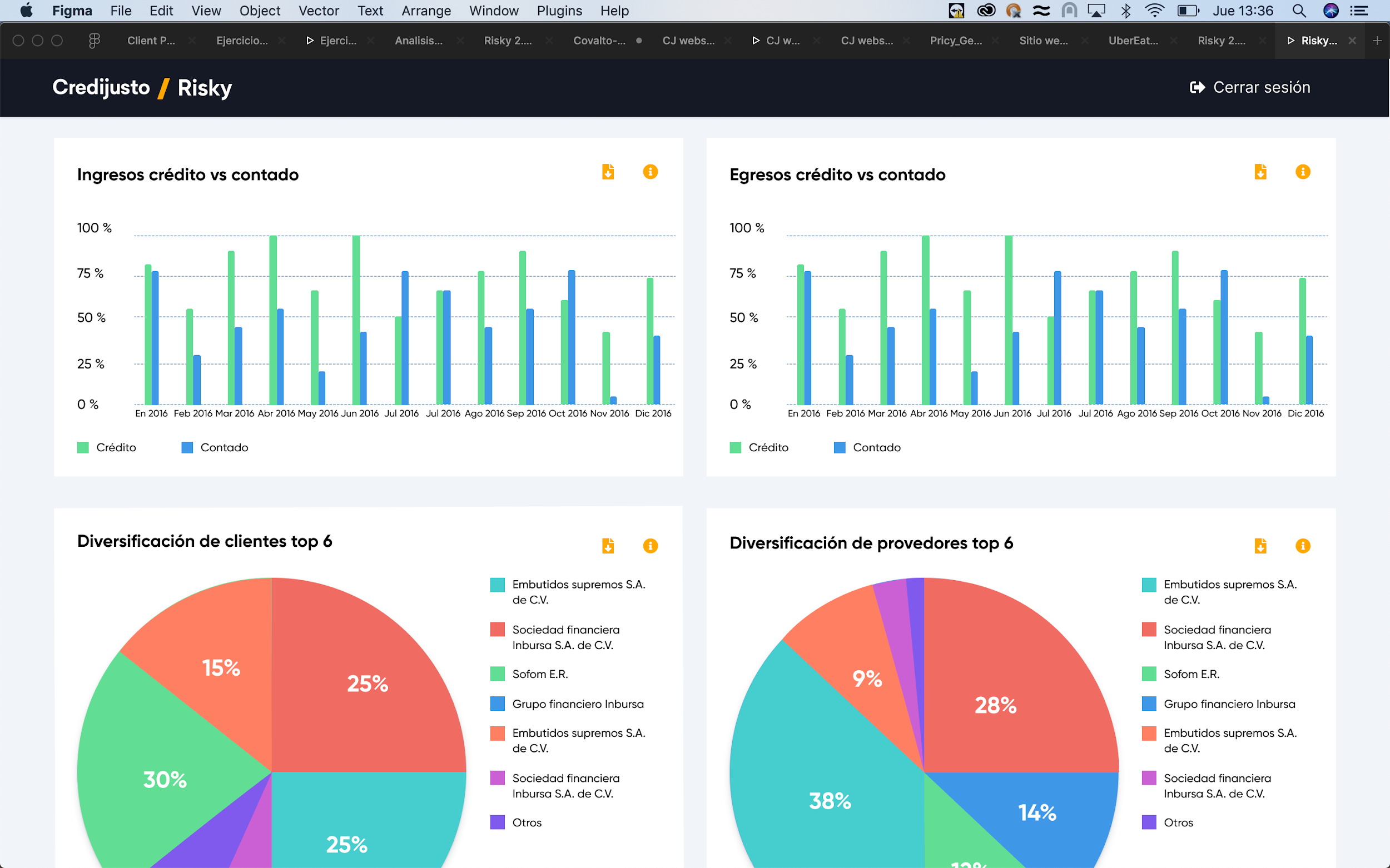
Risky
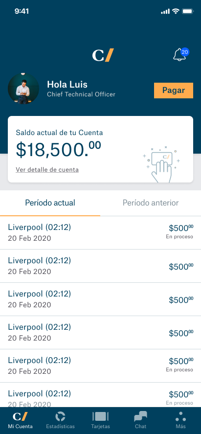
Covalto app
What I learned
A design system is more than components. It's also communication among team members, developers and stakeholders. The biggest challenge was promoting the benefits of a design system, and now Minerals is the foundation of the company.
Thanks for reading.