EFEX
Same Dashboard, Every Client: Redesigning EFEX
A take-home design challenge for a Mexican FX/payments fintech, turned into three dashboards that assemble themselves around who is actually looking at them.
Try the live prototype(opens in a new tab)
- 3 dashboards
- built around who is looking
- 17 findings
- documented with the design
The challenge
A public take-home design challenge for EFEX, a Mexican FX and payments company.
The problem
The dashboard looked the same for every client, every day, so Rate Lock and batch payments stayed invisible.
What I made
Three dashboards that assemble themselves around who is looking, plus an interactive prototype.
Design challenge for EFEX, a Mexican FX and payments company. Not confidential, this was a public take-home exercise, and the interactive prototype is live.
The problem
EFEX's dashboard looked the same for every client, every day. The export owner buried in his heaviest week of transfers saw the same screen as the treasurer managing recurring currency exposure, and the same screen as a client who hadn't logged in for a month. Nothing on it adapted to who was looking or what moment they were in, which meant the two products EFEX most wants clients to discover, Rate Lock and batch payments, stayed invisible to the people who needed them most.
Approach
- Diagnosis first. Ranked the dashboard's problems by what they actually cost the business, not by what was easiest to fix. The root issue: the screen doesn't know who you are or what moment you're in. Everything else, including the two hidden features, is downstream of that.
- Three proto-personas, from real triggers. Instead of one generic redesign, built three dashboards around three concrete signals EFEX already has: a client under the retention threshold, a client with a scheduled supplier payment, and a client with a recurring batch-payment habit.
- Competitive research, corrected in public. Assumed early on that no competitor had solved forward rate locking. A second pass proved that wrong, so the recommendation got rewritten rather than shipped on a false premise.
- No visible mode switcher. The three dashboards had to feel like the product deciding for you, not a manual toggle bolted onto the UI. Each one loads as a complete, resolved screen; there's no in-product control that says "pick your persona."
Key findings
Juan
Owner-operator, agro exporter. Signal: 1 to 4 transactions, below the retention threshold.
"Hola, Juan. ¿Tienes otro pago pendiente esta semana?" Button: Enviar Pago.
María
Treasurer, manufacturing company. Signal: a supplier payment already scheduled.
"Tienes un pago a proveedor en 45 días. ¿Aseguramos la tasa de hoy?" Button: Activar Rate Lock.
AgroLog
Ops team, agricultural logistics. Signal: a history of batched producer payments.
"Hoy es viernes: ¿listo tu pago semanal a productores?" Button: Iniciar Pagos Masivos.
Same product, three signals, three dashboards.
Each dashboard leads with the one thing that persona actually needs to act on, and nothing else competes for that space. Juan gets a nudge toward his next payment. María gets today's rate and a one-tap way to lock it in before her 45-day exposure moves against her. AgroLog's ops team gets a Friday reminder built around the batch-payment habit they've already formed.
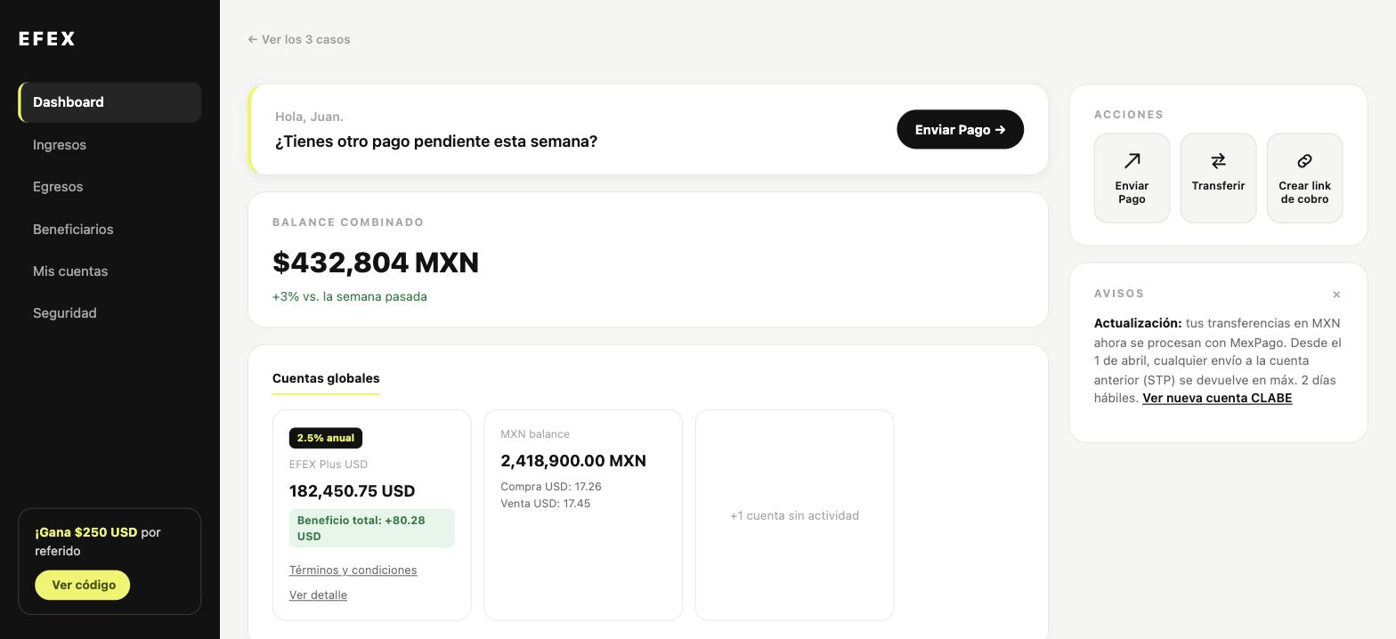
EFEX: Dashboard
Outcome
Delivered as a full diagnosis, final design, and written rationale, plus an interactive prototype covering all three dashboards end to end. The process stayed visible on purpose: 17 findings, corrections, and small decisions got documented alongside the final design, not folded away behind it.